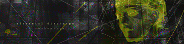
id doubt its from scratch...its probably stocks amarite?
still looks good though
iBotModz CBox
.Twc's Content
There have been 45 items by .Twc (Search limited from 28-April 23)
By content type
See this member's
#48285 So im the s*** k?
 Posted by
on 13 October 2008 - 02:45 PM
in
Showoff
Posted by
on 13 October 2008 - 02:45 PM
in
Showoff
#46133 My Rampant Drug Abuse
Posted by
on 29 September 2008 - 07:49 PM
in
Showoff
oya
c4ds are pretty kl for diff uses
c4ds are pretty kl for diff uses
#46125 My Rampant Drug Abuse
Posted by
on 29 September 2008 - 07:07 PM
in
Showoff
Simple tags can actually turn out quite good.
kr0,gugs,slazella is fairly simple stuff but Damn their stuff turns out great.
kr0,gugs,slazella is fairly simple stuff but Damn their stuff turns out great.
#46124 lmao
Posted by
on 29 September 2008 - 07:03 PM
in
Showoff
what are your other forum names?
kricket/Alpha
Your name on Tm is Revolution 9? i believe
i should reinstall ps to show this noob on how to use c4d properly!!!!!
lmao thats even funnier...what are you going to do spam c4ds get a render do some horrible blending and then throw in some huge disgusting text.
Lol first learn the basics a bit more then talk, ive seen your tags and they are pretty much s***, Your skills havent changed much since well i met Anarchy on ibm and that was on the OLD ibm which was like 1 year and half ago or two.
#46117 My Rampant Drug Abuse
Posted by
on 29 September 2008 - 06:13 PM
in
Showoff
I see where you got the idea from,too repetitive for me.
but hey its clean and simple
but hey its clean and simple
#46116 lmao
Posted by
on 29 September 2008 - 06:08 PM
in
Showoff
not bad for a beginner
lmao
Get some skills first and then talk to me.
#45924 Latest work
Posted by
on 28 September 2008 - 03:17 PM
in
Showoff
i would probably find it more amusing if the boobs said
"betch bring me a sammich"
but thats just me
"betch bring me a sammich"
but thats just me
#45922 lmao
Posted by
on 28 September 2008 - 03:09 PM
in
Showoff
mmm
hated my solid c4d crap so i quit that s*** and moved to better stuff
LOL@threads in here there so much flaming about whats what "bla bla blah is art" and "your s*** sucks"
People seriously dont know what they're talking about.
Anyways thanks f00
hated my solid c4d crap so i quit that s*** and moved to better stuff
LOL@threads in here there so much flaming about whats what "bla bla blah is art" and "your s*** sucks"
People seriously dont know what they're talking about.
Anyways thanks f00
#45917 lmao
Posted by
on 28 September 2008 - 02:44 PM
in
Showoff
Haha i still see this place hasnt changed much, the flaming, the *ick riding,the spam ahhhhh good stuff love this place
No Particular order


Collab with tummeh


No Particular order
Collab with tummeh
#35004 MY GFX APPLICATION
Posted by
on 21 July 2008 - 06:10 PM
in
Graphics
I know my opinion does not matter, i feel like contributing
Now i know i dont know the new standards if we have put any in to the accepting process
Your tags lack real effects that can be the body of the tag, also everything seems to follow the same style taht is bottom corner to top corner flow. lighting needs work
My main complaint is everything seems so generic, when I used to do art I moved away from effects and renders and such and went with things not many other people did if any people did it at all
Your LPs have no point and the last 2 just look like big tags
LPs are more difficult than tags because you cant follow the same creation process, they cant be a render with some smudging, they need concept and good execution
Id disagree Lp's are easier to work with because of the large canvas so its harder to make mistakes.
But yeah since i would stop doing so many of the same type tags and lp's it looks generic as anarchy said.
You should do more of this but with more colors and shapes.

Your blending is pretty bad it looks as if you put the render at the end. Also mixing up those vector/abstract brushes with c4d and suck does not look good. Your typo needs work along with colors.
#33927 Hey Look! I Made Teh Smex
Posted by
on 18 July 2008 - 10:25 AM
in
Showoff
let go of the borders...
kill them.....D:
kill them.....D:
#33007 through the Storm
Posted by
on 16 July 2008 - 02:10 PM
in
Showoff
kill the border, would of been much better in sexy colors.
#33006 tehteh
Posted by
on 16 July 2008 - 02:08 PM
in
Showoff
yeh
i chose the wrong renders for those 2 c4d+pentool ones
the blue one should of been some anime render or sumn.
Anyways thanks.
i chose the wrong renders for those 2 c4d+pentool ones
the blue one should of been some anime render or sumn.
Anyways thanks.
#32787 New love train!!
Posted by
on 15 July 2008 - 05:59 PM
in
Off-Topic
♥
#32782 LAX VS. D1CE VOTE!
Posted by
on 15 July 2008 - 05:54 PM
in
Battle Zone
ahhh cesar the same a$$hole as always....its funny how he makes fun of peoples tags when his suck terribly, when will he grow up and stop sucking PR's members d!cks like every other noob there, go to some real sites. What i do agree with cesar is that you should use c4ds for sprites, they go well together.
anywho i vote for dice,both arent very good but dice;s has colors and such,lax's is messy and monotone.
anywho i vote for dice,both arent very good but dice;s has colors and such,lax's is messy and monotone.
#32780 Good Bye Everyone =[
Posted by
on 15 July 2008 - 05:43 PM
in
Off-Topic
dont leave you quack.
kthnxbai
stay for me and stay for the gfx section.
kthnxbai
stay for me and stay for the gfx section.
#32779 tehteh
Posted by
on 15 July 2008 - 05:38 PM
in
Showoff


 <-- dont like some parts of the right =/
 texture+c4d
 pentool+c4d
 pentool+c4d

#32775 New sig, using textures
Posted by
on 15 July 2008 - 05:33 PM
in
Showoff
floating head ftl,i like the left but the right is to empty and bland...text is eich.
keep workin with it
keep workin with it
#32718 ?S?S?ss
Posted by
on 15 July 2008 - 02:39 PM
in
Showoff
cesar doesn't make tuts cause he's self centered and doesn't care about anyone else <!-- s:) --><!-- s:) --> he think everyone else is a "waste of time". Good majority of those sigs are in my opinion, garbage. sorry if that a flame, i'm treating you how u've treated me in the past.
I dont hold grudges. But yes these tags are bleh.
#28294 HITMAN
Posted by
on 28 June 2008 - 08:32 PM
in
Showoff
DA stocks have copyrights did you make sure they were for public use?
Anyways this might be your best...xept the colors need work and the buildings behind are grainy/too sharpened.
Anyways this might be your best...xept the colors need work and the buildings behind are grainy/too sharpened.
#27884 Anarchy = sex on legs?
Posted by
on 27 June 2008 - 07:26 PM
in
Showoff
oh well when you said they were non-simple i thought you ment your best.
#27733 I Always Be Teh Band G33K - First In 2 Weeks
Posted by
on 27 June 2008 - 10:06 AM
in
Showoff
The text needs work on. The Smudge doesnt go with this style it just messes it up. Composition could be more interesting instead of the guitar just being there standing up you should of tilt it and made it lay down against the right side. Borders are distracting aswell.
#27732 Anarchy = sex on legs?
Posted by
on 27 June 2008 - 10:00 AM
in
Showoff
Some of your compo,effects,and colors need work. I do like the compo on that vendetta one though. And yeah i wouldnt say its novice gfx more like inter. Like i said Concepts are nice but Concepts wont get you anywhere unless you are really good.

^This one need work on compo The smudge you did on the left is not as good as the rights.Would be deffinately better without some of those squares. And some other type of colors in there

This one is pretty cool it has nice compo.

Lol nice concept but the text is bad i dont like how its looks grungy.

Also a nice concept but the smudge is killing it Especially because its "V" type flow. with some wierd flow on the top right and left sides.
Just keep on practicing and s*** and youll get better.
Edit: I just noticed you said these where your lasts.
^This one need work on compo The smudge you did on the left is not as good as the rights.Would be deffinately better without some of those squares. And some other type of colors in there
This one is pretty cool it has nice compo.
Lol nice concept but the text is bad i dont like how its looks grungy.
Also a nice concept but the smudge is killing it Especially because its "V" type flow. with some wierd flow on the top right and left sides.
Just keep on practicing and s*** and youll get better.
Edit: I just noticed you said these where your lasts.
#27513 Legacy made me come back. ;o
Posted by
on 26 June 2008 - 03:19 PM
in
Showoff
my latest i have been working with colors. Recents are still a bit monotone as you said but yeah ive been getting even better.
But no i dont know who those people are.
I just hang at Lethal Media,Tagmonkey,Pr(ego booster),tech,Digital bliss oh and i used to poke around in digital taste.
thanks for the comments...oh and yeah i was nke
But no i dont know who those people are.
I just hang at Lethal Media,Tagmonkey,Pr(ego booster),tech,Digital bliss oh and i used to poke around in digital taste.
thanks for the comments...oh and yeah i was nke
#26701 Legacy made me come back. ;o
Posted by
on 23 June 2008 - 08:34 PM
in
Showoff
liked your old tags better but its great to have you back
my old tags suck...these are getting me semi-pro xD


Community Forum Software by IP.Board 3.4.6
Licensed to: Connor (iBotPeaches)