Please CnC
Looks Better On Bigger Lighter Screen

MeLo Is TeH ReSpEcToR
Posted 24 June 2008 - 06:34 PM
Corporal Grade 1

Posted 24 June 2008 - 09:44 PM
Defender Of Whatever Needs It Most

Posted 24 June 2008 - 09:53 PM
Gunnery Sergeant Grade 4

Posted 24 June 2008 - 10:23 PM
Australian Retired Staff

Posted 25 June 2008 - 01:03 AM
The Guitar Hero From Hell

Posted 25 June 2008 - 01:34 AM
MeLo Is TeH ReSpEcToR
Posted 25 June 2008 - 07:32 AM
Impossible is nothing

Posted 25 June 2008 - 07:51 AM
The Guitar Hero From Hell
Posted 25 June 2008 - 12:58 PM
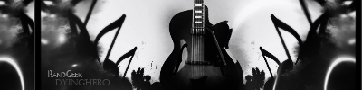
i use all default brushes, i never load any brushes into photoshop except splatters
MeLo Is TeH ReSpEcToR
Posted 25 June 2008 - 02:06 PM
Has been every Staff.

Posted 27 June 2008 - 09:27 AM
lol i just made a sig with a the same kind of theme "feel the music" you should check it out if ya havent yet. but its ok but i agree it is a little monotone and dark.
Private

Posted 27 June 2008 - 10:06 AM


Community Forum Software by IP.Board 3.4.6
Licensed to: Connor (iBotPeaches)
