
cbox


caratti
-
Posts
391 -
Joined
-
Last visited
Content Type
Profiles
Forums
Downloads
Gaming News
Everything posted by caratti
-
yes i am but it was late it's ok but i like the face mask part
-
just somthing i was messing around with just tryin to get used to photoshop again it still a work in progress so im going 2 probabley do the bg tomorrow and change the text i dono if i spelled the fusion right but what ever its late or early either way http://i189.photobucket.com/albums/z30/caratti/fusion.png
-
no one said i was better than anyone and if u did this u would know it wasn't just blurring and depth is and idea behind the project the sig in ur signature has no depth no thought, i gave a whole story on the depth before people started saying theirs no depth. and i like criticism actually that's the only y i can get better but the comments im getting are for the most part bias.
-
vocal was a typo gosh* lol and the red guy is supposed to look like that i wanted the red guy with the flag 2 be the main focus and no depth now ur trying to make stuff up "depth:degree of psychological or intellectual profundity" i just gave u the whole idea of the pic but ur opinion blue equals fail..............mmmmm.......k? the text works perfect of what i tying to do usually it takes me forever to figure out the text but this is flattering on what im tying to do so im happy im not mad even though ur comments scream out grudge but that's ok i like the bg and i hope u guys have a nice night! oo remember simple*
-
blending vocal text blends nice text all in a simple background
-
i mint melo's stuff is simple a art direction of simplicity, and i licked my out come and it was very sexy that all
-
lots of blending messed with the color of course, i basically did what u said with a lil more and alot more detail but i did say "simple" sort of like ur work but the out come was very sexy
-
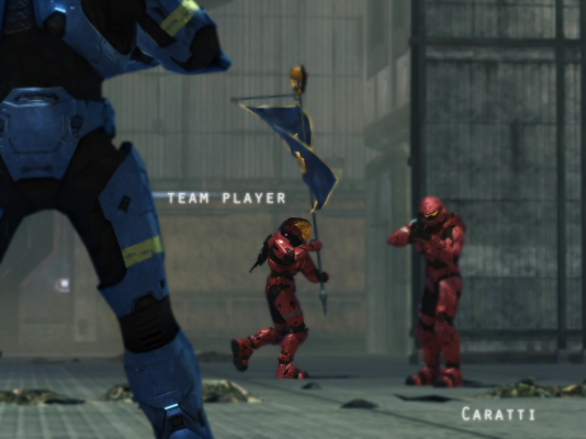
i did it.all every thing u see i took a pic from theater i positioned the camera so i did not just find this off the internet its pretty simple but the outcome is so nice i will take offers so if u want i can put ur name in the place where mine is so just ask tell me what u think here the original piece the direction i was going is direct focus on whats going on, and ur eys went strait to the man with the flag that y its blurred u ever looked at something hard enough were every thing else is blurred that's the effect i was going for. and the camera angle i was going for was a man that died and is looking at the other team running with his flag. and the man looking at the other team running with his flag is pandering y did i die it hit him "team work" what the name team work. I was trying to make something u would see as an add on mlgpro.com and i think i accomplished my goal it looks great on my new rig. so thanx for the comments
-
so lame jk jk its ok
-
it missing: flow balance color( its baically 2 color lighter and darker ofthe 2) efx good text blending fix these and it should look ok
-
the sig is not balanced at all and the text is horrible
-
way 2 plain and change the backgrounded its to similar 2 her skin tone so she is like the inviable women
-
it looks good? i dono mix feelings but melo said nice concept im lost ...................mmmmmmmmmm........what is the concept?
-
i don't insult i say the truth and how i feel isnt that the whole point of showing off so you can see the reaction of other people? i could be wrong though....... and i don't get mad at people that easily (only when people steal my killtac) so im not snapping on you only havening a civil argument by giving my opinion on things
-
Ok i see that i have been hurting people felling; people are saying Caratti is just leaving only bad feedback of my sig and nothing positive, first off im not going too: if i don't talk about it i don't have a problem with it. i only leave bad feedback so u can improve im not going to be a jerk and say its good even thought truly its garbage so im doing u a favor. you think i became good because i settled with a crappy sig no literally took 5 hours to make a sig i tried to make it best as possible i was my hardest critique some times would make a sig and delete it and start over cuz i know i can do it better. No one starts off good do u really think ur gfx gods "Anarchy" and "Cesar" (writing that made me laugh) stated off good it takes time. Even on a great sig i will find something to improve on. All im trying to say is "suck it up and try harder" look i used to suck just like you~ http://i189.photobucket.com/albums/z30/caratti/wow.jpg http://i189.photobucket.com/albums/z30/caratti/monkey-2.jpg http://i189.photobucket.com/albums/z30/caratti/captin-1.jpg http://i189.photobucket.com/albums/z30/caratti/ryu.jpg hard work and you will get good~ http://i189.photobucket.com/albums/z30/caratti/half-life.jpg http://i189.photobucket.com/albums/z30/caratti/master-wit-green-1.jpg http://i189.photobucket.com/albums/z30/caratti/mega.jpg http://i189.photobucket.com/albums/z30/caratti/ven2.jpg http://i189.photobucket.com/albums/z30/caratti/starting-off-good.jpg http://i189.photobucket.com/albums/z30/caratti/bioooo.jpg
-
as a former gfx member i would say no and come back in a month and new material but im no longer a gfx member so thats just my opinion
-
mmmmmm...............do not know where 2 begin? first i would get rid of that creepy render or stock what ever it is and get a better one that might change the whole thing and make it look decent! second different bg it does nothing for the sig now chemistry, and it looks plain and sloppy. theres way more things i can talk about but its late and i don't feel like writing a whole page.
-
i guess........ this is good?
-
the second one is ok the rest need lots of work ur still a beginner so thats good, that means theres lots of room to improve
-
u may ejoy making crappy styles, but it hurts my eyes put this style to sleep and come up with something else
-
what the hell is that man. i cant see what thats supposed to be; it could be a gay porn add and i could not tell!!!!!!!! lighten it up, do something or just put a black mask then put the word art in the middle so it looks like u were trying to do that!!!!
-
wow this sucks lol lol go back to PS and delete every layer except the background and go from there and now do every thing the opposite on what did on this one and it should be a lot better lol lol jk just go read tuts lol
