Jump to content

  •  

  • iBotModz CBox


    Photo

    Calling GFX Gods... I Want Your Help


    • Please log in to reply
    22 replies to this topic

    #1 Dark Master

    Dark Master

      Private Grade 2

    • Members+

    • 81 posts
    • Joined: 18-August 07

    Posted 16 June 2008 - 10:18 AM

    hey guys,

    i know i was never very much of the gfx guy and it has really come back to bit me. i have shown some of you my own website, http://www.aceoftech.com, which has almost nothing relating to halo 3 modding, hacking whatever, so dont think im trying to steal you.

    im posting this because a few members here actually gave me there opinion on my site and said it would be very effective to have forums... so i have been working on forums for a long time, and i need a logo.

    as you can see from the image below, that double red line is the space I have to make a logo... i would like the logo to say "Ace Of Tech" and possibly "Forums" as well. the font i usually use, and the font i use for the big logo on my homepage is called Mamma Gamma (google it) The dimensions for a logo are pretty much 550 width, or 600, something like that by 150 height... and I would like it to blend well with those colors... i thought a white text maybe? but im not the gfx god here.

    Posted Image
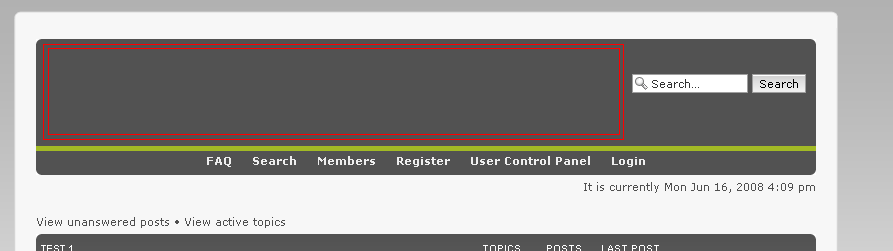
    (the image is cut off a little, but you can still see what I mean, but if you want a better photo...)
    Posted Image

    now i know im not offering a reward here and im hoping you'll just do this for me, but if you really "want" a reward, ill try and see what I can get you.

    any help would be very much appreciated!

    thanks,
    dark master

    #2 .MeLo♥

    .MeLo♥

      Has been every Staff.

    • Retired Staff

    • 1,315 posts
    • Joined: 18-August 07
    • Gender:Male
    • Location:Texas

    Posted 16 June 2008 - 10:54 AM

    Ill do it


    or at least try it


    #3 Dark Master

    Dark Master

      Private Grade 2

    • Members+

    • 81 posts
    • Joined: 18-August 07

    Posted 16 June 2008 - 11:17 AM

    thanks a lot man...

    #4 .MeLo♥

    .MeLo♥

      Has been every Staff.

    • Retired Staff

    • 1,315 posts
    • Joined: 18-August 07
    • Gender:Male
    • Location:Texas

    Posted 16 June 2008 - 11:18 AM

    thanks a lot man...


    Uh oh,
    the triple dot

    Whats wrong?

    #5 .MeLo♥

    .MeLo♥

      Has been every Staff.

    • Retired Staff

    • 1,315 posts
    • Joined: 18-August 07
    • Gender:Male
    • Location:Texas

    Posted 16 June 2008 - 11:53 AM

    K,
    tell me what else you want or what needs changing

    p.s. I think the dimensions you gave are not correct, but ill leave that to you

    #6 Dark Master

    Dark Master

      Private Grade 2

    • Members+

    • 81 posts
    • Joined: 18-August 07

    Posted 16 June 2008 - 12:19 PM

    You did a little more than i thought, to a sense...

    see, in that image the logo is pretty much going to go around that color, so when you throw in this random green to contrast it onto a grey isn't much of a match, you know?

    also, as complex is that is, I'm looking for a little more "simplicity"

    please dont take this the wrong way at all, you are amazing at gfx, its just i guess i didn't describe what i wanted well enough...

    i'll go work on a logo that i think looks good, then maybe you can tell me its all wrong then fix it up

    #7 .MeLo♥

    .MeLo♥

      Has been every Staff.

    • Retired Staff

    • 1,315 posts
    • Joined: 18-August 07
    • Gender:Male
    • Location:Texas

    Posted 16 June 2008 - 12:25 PM

    Simpler?

    #8 TheMasterSnail

    TheMasterSnail

      No Timmy Don't Jump!

    • Retired Staff

    • 461 posts
    • Joined: 18-August 07
    • Gender:Male
    • Location:UK

    Posted 16 June 2008 - 12:31 PM

    Simpler?

    now that is what i call awsome i would have it on my site its so good

    #9 .MeLo♥

    .MeLo♥

      Has been every Staff.

    • Retired Staff

    • 1,315 posts
    • Joined: 18-August 07
    • Gender:Male
    • Location:Texas

    Posted 16 June 2008 - 12:33 PM

    Simpler?

    now that is what i call awsome i would have it on my site its so good


    #10 Dark Master

    Dark Master

      Private Grade 2

    • Members+

    • 81 posts
    • Joined: 18-August 07

    Posted 16 June 2008 - 12:37 PM

    I'll put it on to show you guys what it looks like...

    h/o

    #11 Dark Master

    Dark Master

      Private Grade 2

    • Members+

    • 81 posts
    • Joined: 18-August 07

    Posted 16 June 2008 - 12:40 PM

    okay, go here

    http://version2.aceoftech.com/phpbb/

    to see your banner in, sorry i know i made is smaller, but i figured out the max dimensions: 100h x 550w

    It looks quite good, the only thing that kind sticks out is the thing in the bottom right, if those lines faded it, it might match better.,...

    #12 .MeLo♥

    .MeLo♥

      Has been every Staff.

    • Retired Staff

    • 1,315 posts
    • Joined: 18-August 07
    • Gender:Male
    • Location:Texas

    Posted 16 June 2008 - 12:49 PM

    okay, go here

    http://version2.aceoftech.com/phpbb/

    to see your banner in, sorry i know i made is smaller, but i figured out the max dimensions: 100h x 550w

    It looks quite good, the only thing that kind sticks out is the thing in the bottom right, if those lines faded it, it might match better.,...


    When you say bottom right to you mean bottom left?
    o.O

    #13 Dark Master

    Dark Master

      Private Grade 2

    • Members+

    • 81 posts
    • Joined: 18-August 07

    Posted 16 June 2008 - 12:50 PM

    yeah my bad...

    and could you make the font a wee-bit bigger?

    #14 .MeLo♥

    .MeLo♥

      Has been every Staff.

    • Retired Staff

    • 1,315 posts
    • Joined: 18-August 07
    • Gender:Male
    • Location:Texas

    Posted 16 June 2008 - 12:57 PM

    yeah my bad...

    and could you make the font a wee-bit bigger?


    Better?

    #15 Dark Master

    Dark Master

      Private Grade 2

    • Members+

    • 81 posts
    • Joined: 18-August 07

    Posted 16 June 2008 - 01:05 PM

    i have to say thats pretty frickn beastly....

    thanks alot but im not going to promise that that'll be the final logo for the forums

    #16 .MeLo♥

    .MeLo♥

      Has been every Staff.

    • Retired Staff

    • 1,315 posts
    • Joined: 18-August 07
    • Gender:Male
    • Location:Texas

    Posted 16 June 2008 - 01:08 PM

    i have to say thats pretty frickn beastly....

    thanks alot but im not going to promise that that'll be the final logo for the forums


    Thanks
    I guess you like simple

    Thats cool just as long as i temporarily helped xD

    #17 Dark Master

    Dark Master

      Private Grade 2

    • Members+

    • 81 posts
    • Joined: 18-August 07

    Posted 18 June 2008 - 07:54 AM

    Okay Melo, last thing, considering all my logos suck, I think I'm going to use yours, but I need it to be these exact dimensions: 550w x 100h

    Your other one is 550 x 200, so its close, and also, can you just do the background, and i'll add in the text?

    id you deleted that template or whatnot and don't have it anymore, its fine

    #18 .MeLo♥

    .MeLo♥

      Has been every Staff.

    • Retired Staff

    • 1,315 posts
    • Joined: 18-August 07
    • Gender:Male
    • Location:Texas

    Posted 18 June 2008 - 09:52 AM

    To your liking?

    #19 Dark Master

    Dark Master

      Private Grade 2

    • Members+

    • 81 posts
    • Joined: 18-August 07

    Posted 18 June 2008 - 12:39 PM

    Okay, so close... now can you just change the background color to the other gray color? then it'll be perfect and ill give you some rep points

    #20 .MeLo♥

    .MeLo♥

      Has been every Staff.

    • Retired Staff

    • 1,315 posts
    • Joined: 18-August 07
    • Gender:Male
    • Location:Texas

    Posted 18 June 2008 - 02:46 PM

    o shoot
    yea my bad ill fix it