





Jump to content

  •  

  • iBotModz CBox


    Photo

    New and recent tags


    • Please log in to reply
    9 replies to this topic

    #1 .Nke!

    .Nke!

      Apprentice Grade 2

    • Members+

    • 13 posts
    • Joined: 28-January 08

    Posted 23 February 2008 - 09:40 PM

    Sheaaa

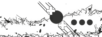
    Posted Image
    Posted Image
    Posted Image
    Posted Image
    Posted Image
    Posted Image
    Posted Image
    Posted Image
    Posted Image
    Posted Image

    #2 caratti

    caratti

      Sergeant Grade 2

    • Members+

    • 391 posts
    • Joined: 27-August 07

    Posted 24 February 2008 - 02:04 AM

    u sharpen to much it looks really wired

    #3 .Slack♠

    .Slack♠

      Gunnery Sergeant Grade 4

    • VIP

    • 1,033 posts
    • Joined: 25-August 07
    • Gender:Male
    • Location:Florida

    Posted 24 February 2008 - 07:57 AM

    hmmm i like a couple the 1st is best to me

    #4 .Nke!

    .Nke!

      Apprentice Grade 2

    • Members+

    • 13 posts
    • Joined: 28-January 08

    Posted 24 February 2008 - 02:30 PM

    u sharpen to much it looks really wired


    i like em wierd

    #5 iBotPeaches

    iBotPeaches

      General Grade 6

    • Owner

    • 6,570 posts
    • Joined: 29-July 07
    • Gender:Male
    • Location:Kansas

    Posted 25 February 2008 - 10:14 PM

    They are a tad vectored alot. Maybe use that vectoring on flash buttons, and spartans?

    Theres quite a need for vectors out there.

    #6 .Nke!

    .Nke!

      Apprentice Grade 2

    • Members+

    • 13 posts
    • Joined: 28-January 08

    Posted 26 February 2008 - 06:02 PM

    Huh?

    I didnt Vector at all lol.Well actually only for that Sean Paul one and Ichigo one which were the effects.But not much vectoring here.

    #7 blacklabelfosho

    blacklabelfosho

      Impossible is nothing

    • Retired Staff

    • 520 posts
    • Joined: 25-August 07
    • Gender:Male
    • Location:SWOSU <-----college :)

    Posted 26 February 2008 - 09:53 PM

    srry i think the sean paul one is the only one i even consider lol.

    the others look like deathgrip did it... lolz jk jk

    #8 Curtis

    Curtis

      Captain Grade 1

    • Retired Staff

    • 1,382 posts
    • Joined: 18-August 07
    • Location:Saskatchewan

    Posted 29 February 2008 - 10:26 PM

    the others look like deathgrip did it... lolz jk jk


    i love you too!

    I'm not good but i try... well used too.

    I just like looking at them and judging them.

    Was i that bad?

    #9 SmokiestGrunl

    SmokiestGrunl

      Australian Retired Staff

    • Retired Staff

    • 3,888 posts
    • Joined: 02-September 07
    • Gender:Male
    • Location:Australia

    Posted 14 March 2008 - 04:37 PM

    I am not usally a big fan of sig that use sprites, but yours look sweet.

    #10 NeoBatWare

    NeoBatWare

      Corporal Grade 1

    • Members+

    • 124 posts
    • Joined: 15-January 08

    Posted 14 March 2008 - 05:04 PM

    Huh?

    I didnt Vector at all lol.Well actually only for that Sean Paul one and Ichigo one which were the effects.But not much vectoring here.


    I consider pretty much all of them vector. The only exception would be the mascot one on the bottom.

    I would say that they are pretty good. The sean paul one is a little too boring, and the mascot one on the bottom doesn't look like you did a whole lot to it. The two with the women are too boring, but the second one is better. The first woman one has nice flow, but there isn't enough going on.

    Of course, I am not a big fan of sigs with stocks with real people in them so I am a little biased. Your Ichigo one is good, even though I have no idea who he is.

    Overall, my favorite one is the second one, and the others are pretty good too.