Posted by
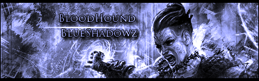
The First Two sigs look a little too sharp and the test needs to be a different color. One that doesn't blend in so much with the B/G.
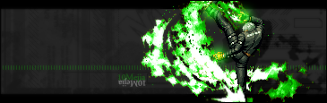
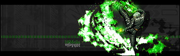
What is the difference between the second sets of Versions 1&2? Did you sharpen the second one up a bit?
Splatter Brushes: http://www.brusheezy...ters&psv=&sort=
Go Crazy!
Alright thanks, i'm not so good with text so i tend to blend it with the BG.Yes i did just sharpen it more...but that can make a big difference to others.