Jump to content

  •  

  • iBotModz CBox


    Photo

    Daft Punk


    • Please log in to reply
    11 replies to this topic

    #1 Pargy

    Pargy

      WTF is a Pargy?

    • VIP

    • 1,466 posts
    • Joined: 25-July 08
    • Gender:Male

    Posted 16 March 2010 - 07:54 PM

    Spazam!

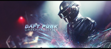
    Posted Image

    Made this for a guy on 7s, really like how it turned out.

    #2 GingerisWIN

    GingerisWIN

      Apprentice Grade 2

    • Members+

    • 16 posts
    • Joined: 21-February 10

    Posted 16 March 2010 - 08:06 PM

    II must say. Everything you make, amazes me in so many ways. I only hope ill be as good as you one day.

    #3 Curtis

    Curtis

      Captain Grade 1

    • Retired Staff

    • 1,382 posts
    • Joined: 18-August 07
    • Location:Saskatchewan

    Posted 16 March 2010 - 09:08 PM

    II must say. Everything you make, amazes me in so many ways. I only hope ill be as good as you one day.


    lol relax jeezey haha.

    Yeah thats a tight image man, loving the effects, :thumbsup:

    and did u use a tut? if so can i see it?
    or maybe can i see ur .psd?

    Edited by Curtis, 16 March 2010 - 09:10 PM.


    #4 Pargy

    Pargy

      WTF is a Pargy?

    • VIP

    • 1,466 posts
    • Joined: 25-July 08
    • Gender:Male

    Posted 16 March 2010 - 09:41 PM

    Nope, didn't use a tut.
    I'll PM you the PSD

    #5 Quinn

    Quinn

      Colonel Grade 3

    • Global Mods

    • 2,323 posts
    • Joined: 29-August 07
    • Gender:Male
    • Location:Canada

    Posted 16 March 2010 - 10:05 PM

    Nope, didn't use a tut.
    I'll PM you the PSD


    Can I has the PSD too?

    #6 D.HeRo♥

    D.HeRo♥

      MeLo Is TeH ReSpEcToR

    • Retired Staff

    • 692 posts
    • Joined: 26-August 07
    • Gender:Male

    Posted 16 March 2010 - 11:29 PM

    not bad man. you've improved since i've been here last time. Colors look great, yet there is still alot of room for impovment. Here's some advice that im just throwin out there from my experience. I can see what your aiming for on this peice as i used to be very interested in this same style. Your c4ds need to be a slightly blended better on the right side as some of the colors seem "off." I recommend trying a selective color used with a clipping mask to edit the colors of some of the c4ds. The placement of the text is nice, and the placement of the focal is great. Kudos on those man. Now, there is only two problems i'd like to adress. The red light in the right-center of your tag, is very distracting from the focal. You need good compostion so the viewers eyes flow across your tag, seeing every aspect of your piece. So in recommendation, i'd say either dim the red light on the side, or completely remove it from your tag, and duplicate your background stock, and mess around with the settings and placement till you get something you like. Negative space can be either good, or bad. too much, or too little will ruin the comp of your tag. The last thing i'd like to critque on is your light source. The upper part of your tag, where the light source is coming down is perfect. But my main concern is the two balls of light in front of your render. They are there, but there is no light on the front of him, its pitch black. I hope you listen to some of my critique, trust me, critique will take you a long way.

    *Dyinghero27*

    #7 Pargy

    Pargy

      WTF is a Pargy?

    • VIP

    • 1,466 posts
    • Joined: 25-July 08
    • Gender:Male

    Posted 16 March 2010 - 11:43 PM

    Wow, thanks a lot, never had anyone be so thorough with their critique.

    I didn't even notice that red light until you said something, now it really annoys me. I'll fix it when i get some time, i'll try to fix the light too.

    #8 Quinn

    Quinn

      Colonel Grade 3

    • Global Mods

    • 2,323 posts
    • Joined: 29-August 07
    • Gender:Male
    • Location:Canada

    Posted 17 March 2010 - 01:29 PM

    not bad man. you've improved since i've been here last time. Colors look great, yet there is still alot of room for impovment. Here's some advice that im just throwin out there from my experience. I can see what your aiming for on this peice as i used to be very interested in this same style. Your c4ds need to be a slightly blended better on the right side as some of the colors seem "off." I recommend trying a selective color used with a clipping mask to edit the colors of some of the c4ds. The placement of the text is nice, and the placement of the focal is great. Kudos on those man. Now, there is only two problems i'd like to adress. The red light in the right-center of your tag, is very distracting from the focal. You need good compostion so the viewers eyes flow across your tag, seeing every aspect of your piece. So in recommendation, i'd say either dim the red light on the side, or completely remove it from your tag, and duplicate your background stock, and mess around with the settings and placement till you get something you like. Negative space can be either good, or bad. too much, or too little will ruin the comp of your tag. The last thing i'd like to critque on is your light source. The upper part of your tag, where the light source is coming down is perfect. But my main concern is the two balls of light in front of your render. They are there, but there is no light on the front of him, its pitch black. I hope you listen to some of my critique, trust me, critique will take you a long way.

    *Dyinghero27*


    *Brain Melts*

    #9 D.HeRo♥

    D.HeRo♥

      MeLo Is TeH ReSpEcToR

    • Retired Staff

    • 692 posts
    • Joined: 26-August 07
    • Gender:Male

    Posted 17 March 2010 - 06:06 PM

    *Brain Melts*


    I just had to do it man :) there needs to be one proper critque every now and then since everyone has left :o :(

    #10 Curtis

    Curtis

      Captain Grade 1

    • Retired Staff

    • 1,382 posts
    • Joined: 18-August 07
    • Location:Saskatchewan

    Posted 17 March 2010 - 09:06 PM

    I just had to do it man :) there needs to be one proper critque every now and then since everyone has left :o :(


    Dewd u should stick around, im working on getting SOTW back and contests

    #11 D.HeRo♥

    D.HeRo♥

      MeLo Is TeH ReSpEcToR

    • Retired Staff

    • 692 posts
    • Joined: 26-August 07
    • Gender:Male

    Posted 17 March 2010 - 10:06 PM

    Dewd u should stick around, im working on getting SOTW back and contests


    Im definitel going to stick around. This is the only site i come to still :) i just havent had that much free time lately, but ill try to get on as much as possible. With SOTW coming back, it looks like im gunna have to get back into the habit of graphics :o i will make my full return, i promise. but for now ill just be making tags every now and then, on giving critque on members peices.

    Ps..... heres my most recent, just some default brushes and tools in photoshop..gift for curtis<3

    Newnewnewsiggy copy.jpg

    I<3ibotmodz.

    *Dyinghero27

    Edited by D.HeRo♥, 17 March 2010 - 10:07 PM.


    #12 Slidell

    Slidell

      IBM Life Support

    • VIP

    • 2,863 posts
    • Joined: 18-July 08
    • Gender:Male
    • Location:New Orleans

    Posted 18 March 2010 - 01:14 PM

    Posted Image
    I came.